1. In what way does our media product use, develop or challenge forms and conventions of real media products?
Form:
- Titles
 |
| Credits from The Last of Us |
 |
| (Video shortened down to show only credits) |
- The title credits present in the opening sequence are somewhat resemblant to that seen in the title sequence of The Last of Us(Stradley, 2013) wherein the text animation fades into the shot. Additionally, the text in our opening is similarly placed into the "blank" areas of the shot, without ruining the composition. However, where our titles break the common conventions of titles is in the fact that it is not a title sequence in itself, but an integration of both opening sequence and title sequence.
 |
| Title from Se7en |
 |
| Our title |
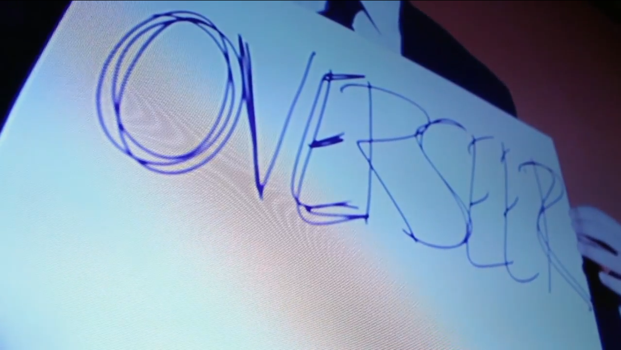
- The main title of the opening sequence, "Overseer", is in itself unconventional, compared to many other psychological horrors. In this case, the title is integrated into the sequence itself, without a cut to black or title animation, which is otherwise common in horror openings, to make it clear to the audience what the title of the film is. (Comparison to the right)
- Plot
- The
way in which the opening sequence is played establishes it as exactly that – an
opening sequence – more than a trailer, by keeping the ending of the opening
sequence open for interpretation and exploration within the psychological horror/thriller genre, making it conventional to both of these genres. It is unknown as to who it is that is knocking on the door, and the story can therefore evolve in different ways. If we had more time to add onto the opening, this could have been the antagonist himself, a friend of the protagonist or someone who is equally threatened by the antagonist.
- Character Exposition
- In-cluing: Bits of the protagonist's memories are shown during the flashback sequence, so that the audience quickly gets a glance of past events – as opposed to having the information dumped onto them. In some respects, this is akin to Memento (Nolan, 2000), where some sequences are flashbacks that reveal parts of the protagonist's past memories. This is important to note, as it emphasises the plot-aspect of psychological horror, where the protagonist is somehow attacked on a mental level. As such, the in-cluing is conventional for this sub-genre.
(Screenshots from our opening sequence below)


- Enigma established
- Is quickly established that the protagonist has no idea as to what happened to him, which establishes the enigma in front of him to solve and escape. This is conventional in the sense that psychological horror, from the genre-research we have done, often places puzzles for the protagonist to solve or, in this case, forces the protagonist into searching for clues as to what has happened and why.
Conventions
- Characters

- The protagonist is a challenging character to pin-point, as he displays both elements of a stereotypical, bravado male, while simultaneously showing elements of a physically weaker, perhaps in some respects more modern representation of a male character. Additionally, the fact that the protagonist is featured in a psychological horror is already conventional-breaking, as we noticed through our research and analysis of films that many of the characters featured in psychological horror are females - an example being Jodie Foster in Silence of the Lambs (Demme, 1991). The opening sequence protagonist is careful, and instead of using brawn to fight his way through his condition, he draws upon his intellect to deal with the situation wherein he is placed. The point on which he falls under the conventions is the fact that he is a civilian, which could potentially mean that he is to be considered a stock character.
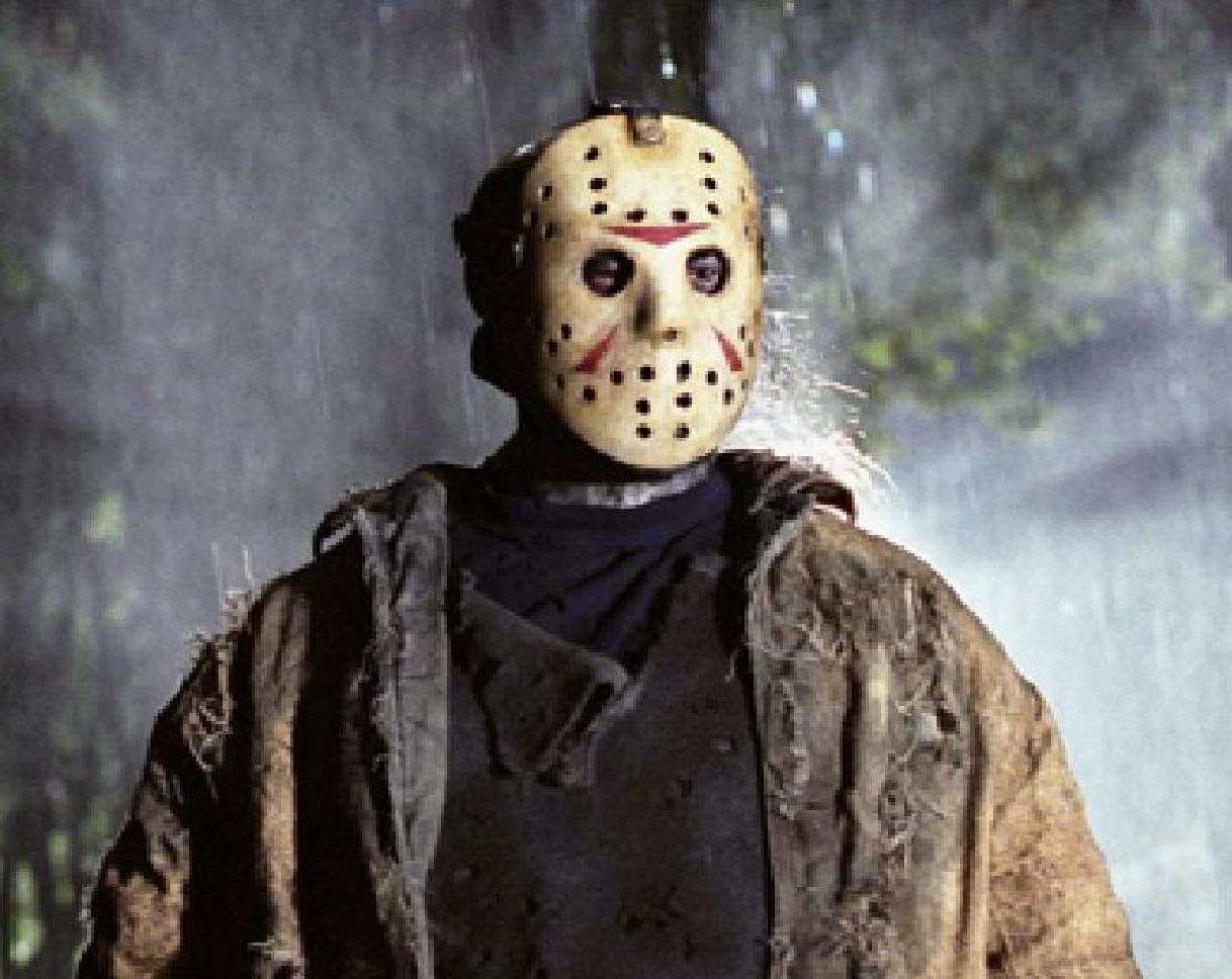
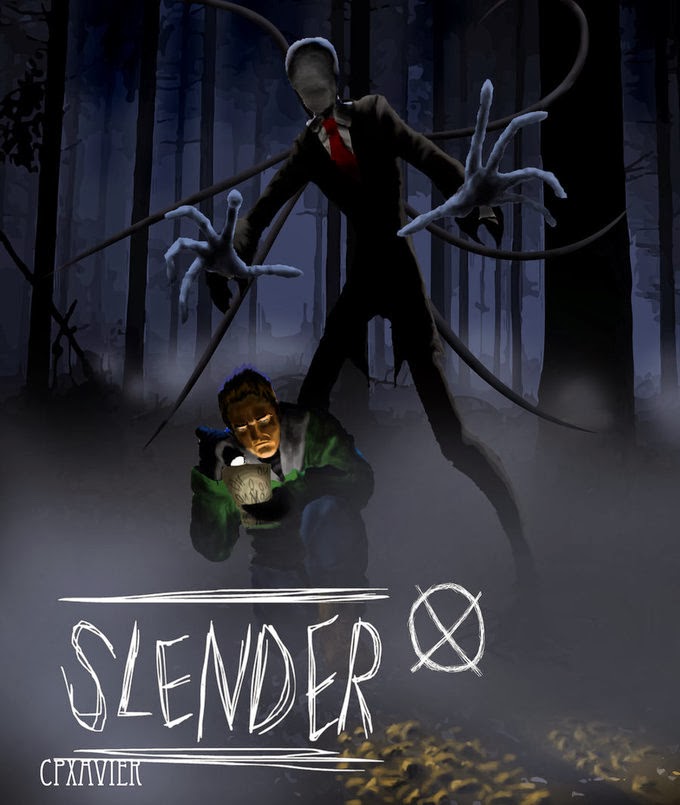
- The antagonist is a very conventional and archetypal character. While not directly related to the same horror genre, the antagonist is somewhat resemblant of masked monsters featured in teen slasher films, such as Jason Voorhees from the Friday the 13th franchise. Furthermore, the suit is somewhat resemblant of the urban-online-legend Slenderman (shown below).
 |
| The Overseer, combining the two mentioned characters |
 |
| Jason Voorhees |
 |
| Slenderman |
- Plot
- On par with psychological horror, the protagonist is thrown into a situation where in his memory is under threat from an outside force. In some respects, this is closer to the genre of psychological thriller, but is arguably also the point where the two genres overlap each other. In the conventions of psychological horror, the aspect of playing with the protagonist's or the audience's psyche, sometimes playing with both. In a psychological thriller, the same aspect can be noted, but with additional themes such as being confined or obsession. Both of these two themes can be analysed from the opening sequence of Overseer, as the protagonist is confined within the walls of a house and is at the mercy of The Overseer's obsessive playfulness.
- Mise-en-scene
- The lighting in the opening sequence is unconventional when placed in the context of the horror-genre, as it is shot predominantly in high-key lighting. In this sense, it is quite similar to the opening sequence of Funny Games (Haneke, 1997), where the lighting is high-key and the sun is shining, which completely removes the eeriness otherwise present in low-key horror films.
- Costume
- Asides from the visual signifiers of the costumes, the costume worn by the protagonist is what most would consider as being civilian, which falls into the conventions of both horror and thriller - the idea that everyday people are thrown into life-or-death situations.
- The antagonist's costume, as touched upon under characters, draws upon the urban legend Slenderman and Jason Voorhees, which in itself can be seen as a form of homage to the conventional characters of horror media.
- Pro-filmic effects

- The pro-filmic effect of the "5" carved into the hand of the protagonist is directly connected to the overall genre of horror, making it conventional for both psychological thriller and horror, as they, as mentioned before, overlap each other, as they both draw heavily from one another. Additionally, the "5" is to some extent related to the typography present in the credits, as it is "drawn" with a knife or other sharp object. The title and threatening message are both drawn onto paper, in a sharp yet discordant manner.
- The polaroid pictures that act as clues in the opening sequence could be considered a homage to Memento, but as to whether or not it is conventional is not easy to say. In any case, the fact that there are clues to follow is conventional in the thriller genre, where there is typically a mystery to be solved, where the protagonist must piece together the clues and evidence to solve the case.
- Location
 |
| Living Room: Relaxation and low stress |
 |
| Bed: Comfort and security |
- The aspect of location is directly conventional with psychological horror, as it is a deceptively ordinary home that the protagonist wakes up in. As such, it could be considered a stock-location for the opening sequence.
- Sound
- The non-diegetic sound present in the opening in form of the score is conventional in the sense that the underlying deep music is foreboding and ominous, which in some respects warns the audience that something will happen. It is the build up that creates tension.
- The diegetic sound is directly connected to the conventions of the character: after his flashback, he displays an expression of fear in his voice, fear being a key aspect of the horror genre.
- Camera
- The camera is primarily focused on the protagonist, which is evident throughout the opening sequence. This is to position the audience with the character, which in itself is conventional for film in general, as the main idea is to create a relatable character that the audience will root for. As such, the camerawork involved in the opening sequence consists of several shots of the lead.
- This is emphasised through close-up and tracking shots(example of tracking shown below).
 |
| Example 1 |
 |
| Example 2 (from two tracking shots) |
- There are very few conventional breakers, one of these being the very first shot of the protagonist, where he breaks the fourth wall by looking directly at the camera. This is also done in Funny Games, where one of the men in white looks directly at the camera with a better-knowing smile and a wink. This is especially unsettling as it puts the audience off edge, and can therefore be considered conventional camerawork for the psychological horror genre.


- Editing
- The editing is largely done in continuity editing, with many matched cuts to underline the progressive storyline. The cutting rate is initially slow, hastens when the lead gets out of bed and then slows down again after the flashback. This is to give the audience time to comprehend what is going on and to depict and emphasise the sensation of nausea within the character before collapsing, which can therefore be considered a conventional aspect of the psychological horror genre.
- In the beginning of the flashback sequence, the effect of a fade-out to white and fade-in to the memories is added. Additionally the cutting rhythm becomes quick, which connotes confusion and disorder in the memories. Especially the latter further emphasises the conventions of psychological horror, inducing discord and mystery to the film.
- Typography
 |
| Overseer Director |
 |
| The director of The Shining |
The interesting fact about the typography is the similarity to the font used in The Shining (Kubrik, 1980). This rather monochrome colour stands out from the white colours of the location, which is once more similar to The Shining, the difference being that it is a blue font that is used and that our opening sequence has the text placed harmoniously in the shot, as to not interrupt the composition. It can be considered conventional for these reasons.
- Colour/Visual techniques

- The colours evident in the opening sequence are all somehow connected to the genre of thriller and horror. These colours include white,
black and red, and act as visual signifiers to the observant audience. The colours are most notable on the costumes themselves, with white being the most dominant colour. White means a clean mind, which connotes the idea of memory
loss. Combined with the cold whites of the location, it helps to emphasise the conventions of psychological horror - not knowing one's identity, or otherwise being threatened on a psychological basis.
- The black suit worn by the antagonist consists of blacks and whites. While the colour white for the protagonist connotes not knowing ones identity, the white shirt with a black tie and suit connotes a serious demeanour, whilst the black and white mask connotes something different entirely. In essence, the dual colours of the mask connote the idea that the antagonist is both playful (the white of the mask) and simultaneously evil (the black, as it is connected with darkness and the unknown). This dual-personality can be associated with Multiple Personality Disorder, with the colours reflecting this aspect of the antagonist. This could be connected to the conventions of psychological-horror/thriller, as the name of the genre suggests that it is not necessarily the protagonist who is troubled by something psychological.
2. How does our media product represent particular social groups?
3. What kind of media institution might distribute your media product and why?
4/5. Who would be the audience for your media product? How did you attract/address your audience?
6. What have you learnt about technologies from the process of constructing this product?
http://www.slideboom.com/presentations/953880/Technology
I highly recommend clicking the link and downloading the powerpoint, as it gives a much better quality (it certainly does on my computer) and the .gifs are shown in much better detail and are not overly laggy, as it is here.


